Most people do not wake up wanting another web account. They want one clean graphic for a slide deck, a lab report, or a client update, and then they want to move on with their day. The frustration usually starts inside spreadsheet software, where turning a simple table into a presentation-ready figure means wrestling with default styling, digging through nested menus, and manually fixing alignment after every tweak. A free chart builder called Table To Chart was created to collapse that whole chore into a single paste-and-click flow that runs entirely in the browser.
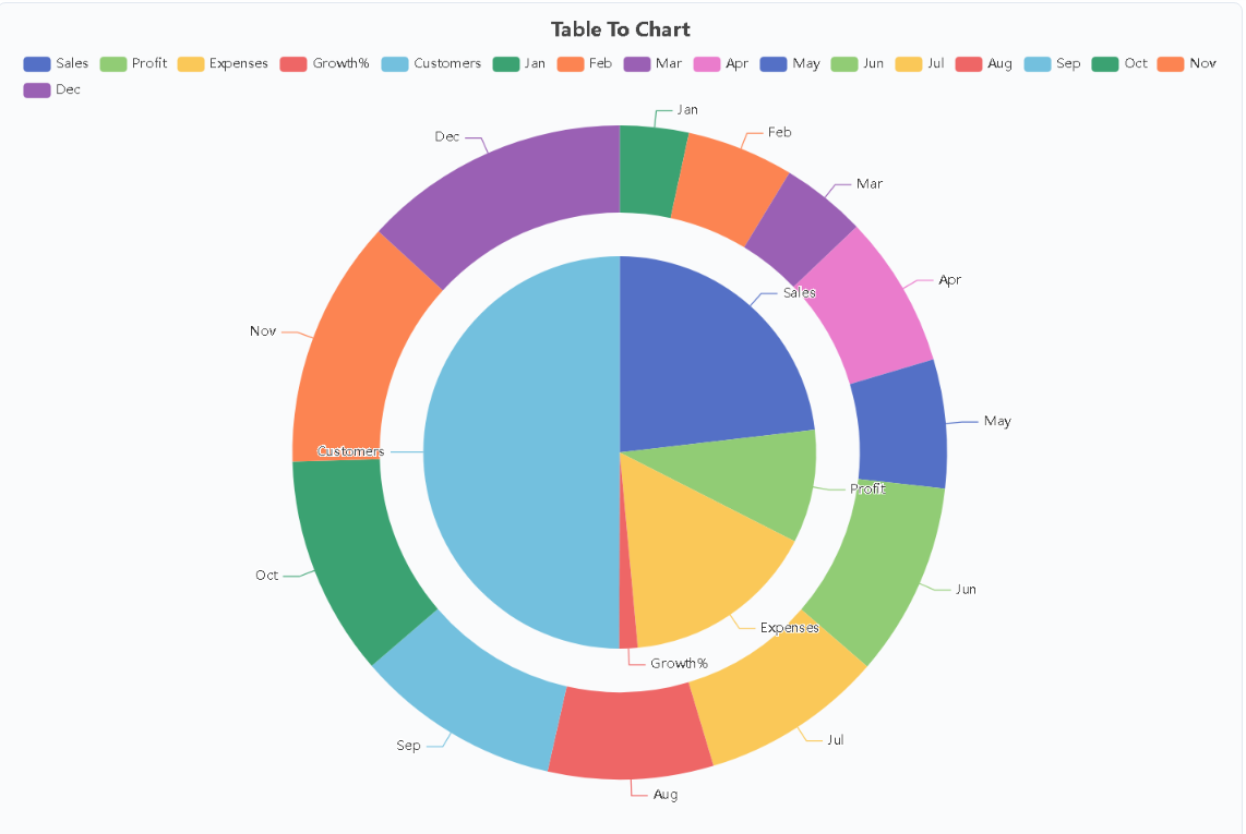
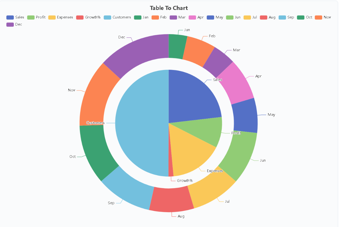
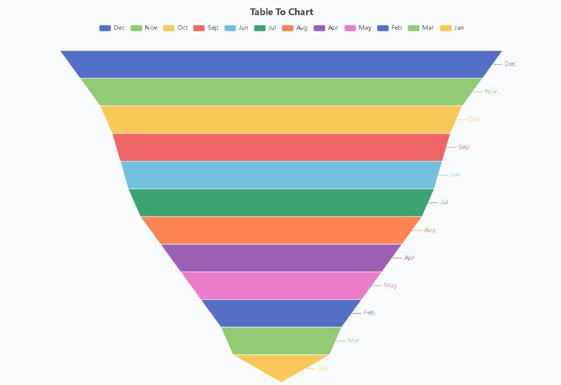
The workflow is deliberately short. You copy rows straight from Excel, Google Sheets, or any CSV source, or you upload an existing workbook file, and the editor detects the table layout on its own. Choose one of eleven visual styles, press a button, and the figure renders immediately at export quality. The input grid stretches as the dataset grows, so there is no manual resizing step, and newcomers routinely go from raw numbers to a finished download in less than a minute. Because everything renders locally, there is no queue and no waiting for a server round trip.
Eleven Chart Styles Without Paywalls or Watermarks
The catalogue covers the everyday analytical shapes: smooth trend lines, classic line plots, vertical columns, horizontal bars, pies, filled areas, scatter clouds, dual-ring compositions, radar webs, heatmaps, and funnels. Each style exports at high resolution, so the same file works in a projected keynote and in a printed handout. What sets the approach apart is the list of things it refuses to do. There is no registration wall asking for an email address, no badge stamped across the graphic, no locked menu hiding half the options behind a subscription, and no silent retention of uploaded tables. If a control appears on the page, it works right away at no charge, with no trial clock ticking in the background.
Local Rendering Keeps Sensitive Numbers Private
Privacy is the strongest argument for doing the computation on the device rather than in the cloud. People frequently visualise figures they cannot afford to leak: quarterly revenue breakdowns, classroom grades, laboratory readings, or customer metrics shared under contract. With this design, pasted rows never leave the tab. Nothing is transmitted, logged, or archived elsewhere, and closing the page erases the session completely. For teams handling confidential material, that property matters more than any extra theme pack. A browser-based chart generator that never sees your data sidesteps a whole category of compliance worry that comes with uploading spreadsheets to distant servers.
From Lab Benches to Boardrooms
The audience is broad precisely because the need is generic. Students convert experiment measurements into diagrams they can submit. Teachers prepare illustrations for the next lesson without booking IT support. Analysts polish a hurried export before it reaches a manager. Founders and marketers pull together a single visual for a pitch without starting another paid plan. Consider two concrete scenarios the format handles well. A biology undergraduate with three weeks of growth measurements can paste the columns, pick a spline view to show the curve, and export a crisp figure for the methods section. A neighbourhood bakery owner comparing weekend versus weekday sales can drop the totals into a bar view and place the result on a flyer the same afternoon. Neither person needed lessons in design software, and neither had to hand over personal details.
Small Habits That Make Charts Read Better
A few presentation habits raise the quality further. Keep category labels short so axes stay legible, start bar baselines at zero unless there is a defensible reason to zoom, and match the shape to the message: lines for change over time, bars for side-by-side comparison, pies or rings for shares of a whole, heatmaps for dense cross-tabulated patterns. One graphic per message beats a crowded dashboard, and a plain descriptive caption helps readers who skim. The tool under discussion fits that philosophy by staying out of the way: paste, pick, download, and return to the actual work the chart was meant to support.